RecyclerView高级特性——ItemDecoration
RecyclerView高级特性系列:
- ListView、RecyclerView缓存策略解析
- RecyclerView高级特性——拖拽排序以及滑动删除
- RecyclerView高级特性——ItemDecoration
- RecyclerView的一些使用细节——多级嵌套时的缓存优化、smooth scroll问题
其实本篇文章很早之前就该出来了,但是实在琐事比较多,而且要学的东西也挺多,所以一直到现在才抽空记录一下。
RecyclerView.ItemDecoration最常见的作用就是用来绘制RecyclerView Item之间的分割线。但如果你认为它只能用来绘制分割线,那就大错特错了。这里结合一个具体项目的需求来谈谈RecyclerView.ItemDecoration高级一点的用法。
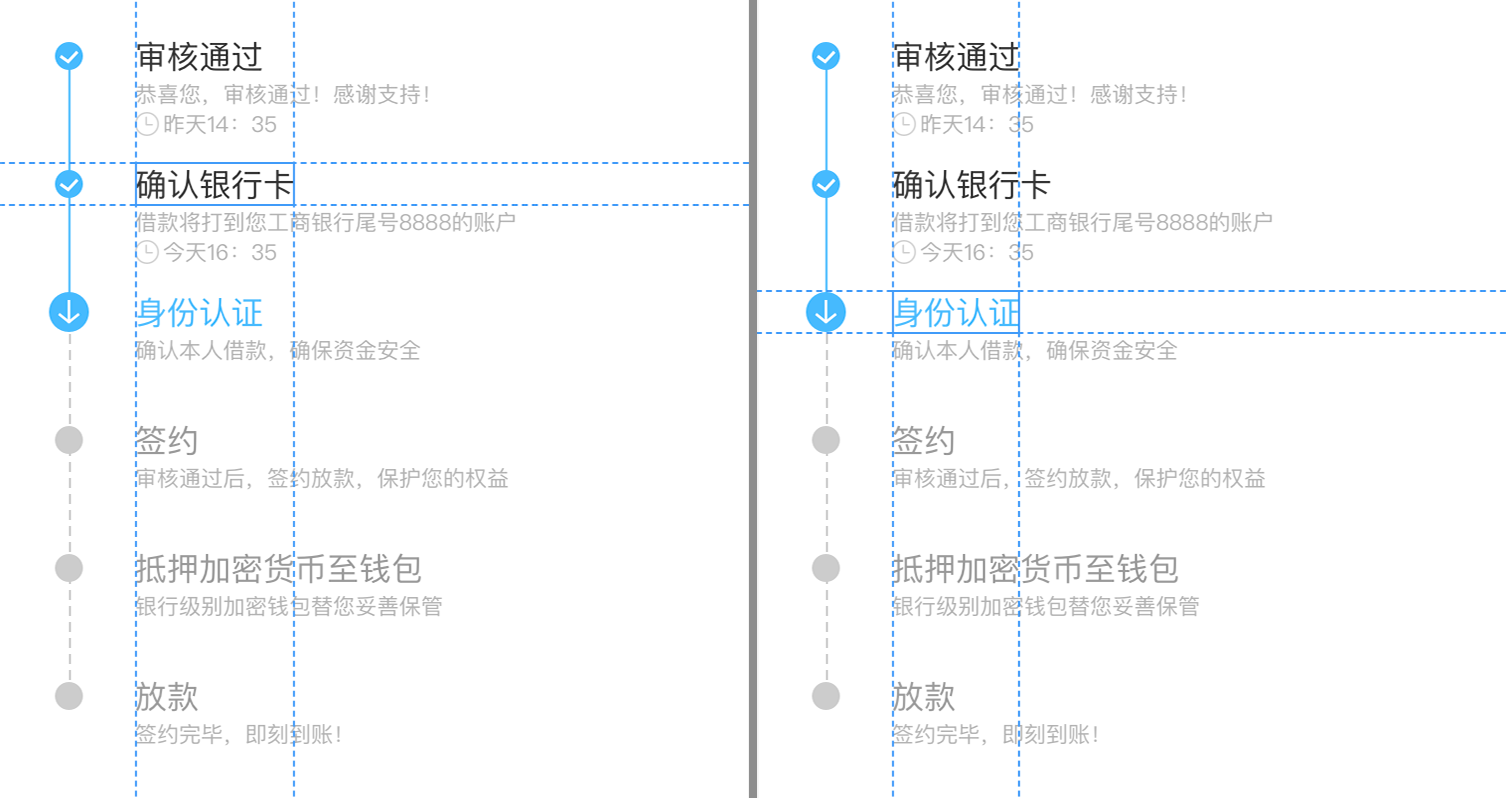
具体需求如上所示,首先整体上可以肯定是一个RecyclerView,然后看看item如何实现。Item可以分为左右两边,右边的好实现,关键是左边的时间轴有点麻烦。
从图中可以注意到,正在进行的item icon比较大,刚好和title上下对齐;其他状态的item icon都相对于title居中显示。那么对于这种状态下的item,时间轴要怎么画呢?
思路:
-
以icon为划分,上面一个短线条、下面一个长线条。这样的画,上面一个短线条的怎么显示取决于上一个item,下面一个长线条则取决于当前item。这就是说,绘制当前item时还需要知道上一个item的信息。
实现有点麻烦了,而且也不优雅。 -
左边的轴交给
RecyclerView.ItemDecoration实现,RecyclerView只需要按照常规的写法显示右边的一些信息即可。这样的实现很优雅。
综合考虑,采用了第二种方案。在贴实现代码之前,先了解一下RecyclerView.ItemDecoration类的一些方法。
1 RecyclerView.ItemDecoration
RecyclerView.ItemDecoration类是一个抽象类,所有可以override的方法只有3组:
RecyclerView.ItemDecoration
/**
  * An ItemDecoration allows the application to add a special drawing and layout offset
  * to specific item views from the adapter's data set. This can be useful for drawing dividers
  * between items, highlights, visual grouping boundaries and more.
  *
  * <p>All ItemDecorations are drawn in the order they were added, before the item
  * views (in {@link ItemDecoration#onDraw(Canvas, RecyclerView, RecyclerView.State) onDraw()}
  * and after the items (in {@link ItemDecoration#onDrawOver(Canvas, RecyclerView,
  * RecyclerView.State)}.</p>
  */
public abstract static class ItemDecoration {
    /**
      * Draw any appropriate decorations into the Canvas supplied to the RecyclerView.
      * Any content drawn by this method will be drawn before the item views are drawn,
      * and will thus appear underneath the views.
      *
      * @param c Canvas to draw into
      * @param parent RecyclerView this ItemDecoration is drawing into
      * @param state The current state of RecyclerView
      */
    public void onDraw(Canvas c, RecyclerView parent, State state) {
        onDraw(c, parent);
    }

    /**
      * @deprecated
      * Override {@link #onDraw(Canvas, RecyclerView, RecyclerView.State)}
      */
    @Deprecated
    public void onDraw(Canvas c, RecyclerView parent) {
    }

    /**
      * Draw any appropriate decorations into the Canvas supplied to the RecyclerView.
      * Any content drawn by this method will be drawn after the item views are drawn
      * and will thus appear over the views.
      *
      * @param c Canvas to draw into
      * @param parent RecyclerView this ItemDecoration is drawing into
      * @param state The current state of RecyclerView.
      */
    public void onDrawOver(Canvas c, RecyclerView parent, State state) {
        onDrawOver(c, parent);
    }

    /**
      * @deprecated
      * Override {@link #onDrawOver(Canvas, RecyclerView, RecyclerView.State)}
      */
    @Deprecated
    public void onDrawOver(Canvas c, RecyclerView parent) {
    }


    /**
      * @deprecated
      * Use {@link #getItemOffsets(Rect, View, RecyclerView, State)}
      */
    @Deprecated
    public void getItemOffsets(Rect outRect, int itemPosition, RecyclerView parent) {
        outRect.set(0, 0, 0, 0);
    }

    /**
      * Retrieve any offsets for the given item. Each field of <code>outRect</code> specifies
      * the number of pixels that the item view should be inset by, similar to padding or margin.
      * The default implementation sets the bounds of outRect to 0 and returns.
      *
      * <p>
      * If this ItemDecoration does not affect the positioning of item views, it should set
      * all four fields of <code>outRect</code> (left, top, right, bottom) to zero
      * before returning.
      *
      * <p>
      * If you need to access Adapter for additional data, you can call
      * {@link RecyclerView#getChildAdapterPosition(View)} to get the adapter position of the
      * View.
      *
      * @param outRect Rect to receive the output.
      * @param view    The child view to decorate
      * @param parent  RecyclerView this ItemDecoration is decorating
      * @param state   The current state of RecyclerView.
      */
    public void getItemOffsets(Rect outRect, View view, RecyclerView parent, State state) {
        getItemOffsets(outRect, ((LayoutParams) view.getLayoutParams()).getViewLayoutPosition(),
                parent);
    }
}
上面这段代码就是ItemDecoration类的声明,可以看到只有三个方法需要override——onDraw、onDrawOver、getItemOffsets。
在注释中仍然有一些非常实用的解释:
- 所有的
ItemDecoration按照被添加的顺序进行绘制 ItemDecoration.onDraw可以通过Canvas绘制任意装饰到RecyclerView上
该方法会在item views绘制**之前**调用,所以绘制的内容会显示到views的**下面**ItemDecoration.onDrawOver可以通过Canvas绘制任意装饰到RecyclerView上
该方法会在item views绘制**之后**调用,所以绘制的内容会显示到views的**上面**ItemDecoration.getItemOffsets可以通过设置outRect的值来设置item view的inset(和padding或margin类似)
outRect的默认实现以会设置且返回为0- 如果需要访问
Adapter获取更多的信息,可以调用RecyclerView.getChildAdapterPosition(View)来获取该View的adapter位置
2 实现UI效果
在了解了ItemDecoration相关的知识后,我们看一下最开始的时间轴的写法:
class CertProgressItemDecoration : RecyclerView.ItemDecoration() {

    /** doing的下标,后台传递的数值从1开始 */
    var activeStepIndex = -1
    /** 除了虚线之外的Paint */
    private val paint = Paint()
    /** 虚线相关 */
    private val dashPath = Path()
    private val dashPaint = Paint()

    init {
        paint.strokeWidth = SizeUtils.dp2px(1F).toFloat()
        paint.color = Color.WHITE
        paint.isAntiAlias = true

        dashPaint.strokeWidth = SizeUtils.dp2px(1F).toFloat()
        dashPaint.style = Paint.Style.STROKE
        dashPaint.isAntiAlias = true
        dashPaint.pathEffect = DashPathEffect(floatArrayOf(SizeUtils.dp2px(6F).toFloat(), SizeUtils.dp2px(3F).toFloat()), 0F)
    }

    override fun getItemOffsets(
        outRect: Rect?,
        view: View?,
        parent: RecyclerView?,
        state: RecyclerView.State?
    ) {
        // item左边的部分距离左边68dp,所以左边的时间轴部分设置为68dp
        // 其他三个方面都不需要额外处理
        outRect?.set(SizeUtils.dp2px(68F), 0, 0, 0)
    }

    override fun onDrawOver(c: Canvas?, parent: RecyclerView?, state: RecyclerView.State?) {}

    override fun onDraw(c: Canvas?, parent: RecyclerView?, state: RecyclerView.State?) {
        parent ?: return
        c ?: return

        for (i in 0 until parent.childCount) {
            val child = parent.getChildAt(i)

            // 需要绘制的矩形坐标
            val left = 0F
            val top = child.top.toFloat()
            val right = SizeUtils.dp2px(68F).toFloat()
            val bottom = child.bottom.toFloat()

            // 绘制背景
            // 由于整个RecyclerView是没有设置颜色的,颜色都由item进行绘制
            // 但是我们设置了item view左边的inset,所以这里需要绘制上背景颜色
            paint.color = Color.WHITE
            c.drawRect(left, top, right, bottom, paint)

            val recyclerAdapter = parent.adapter
            // 当前要绘制的data的下标
            val dataIndex = i
            // data的总数
            val dataCount = parent.childCount

            // 时间轴的中心
            val centerX = (right - left) / 2
            // 时间轴icon所在的centerY值
            // doing状态icon size为22dp
            val bPartTop = SizeUtils.dp2px(11F) + top
            // 当前item的上半根线条
            val lastDataIndex = dataIndex - 1
            if (dataIndex != 0) {
                if (lastDataIndex < activeStepIndex) {
                    paint.color = parent.context.getColorCompact(R.color.colorAccent)
                    c.drawLine(centerX, top, centerX, bPartTop, paint)
                } else if (lastDataIndex != dataCount - 1) {
                    dashPaint.color = parent.context.getColorCompact(R.color.colorTimeLineUndo)
                    dashPath.reset()
                    dashPath.moveTo(centerX, top)
                    dashPath.lineTo(centerX, bPartTop)
                    c.drawPath(dashPath, dashPaint)
                }
            }
            // 当前item的下半根线条
            if (dataIndex < activeStepIndex) {
                paint.color = parent.context.getColorCompact(R.color.colorAccent)
                c.drawLine(centerX, bPartTop, centerX, bottom, paint)
            } else if (dataIndex != dataCount - 1) {
                dashPaint.color = parent.context.getColorCompact(R.color.colorTimeLineUndo)
                dashPath.reset()
                dashPath.moveTo(centerX, bPartTop)
                dashPath.lineTo(centerX, bottom)
                c.drawPath(dashPath, dashPaint)
            }
            // 画icon
            val bitmap = when {
                dataIndex < activeStepIndex -> BitmapFactory.decodeResource(parent.context.resources, R.drawable.ic_timeline_tick_n)
                dataIndex == activeStepIndex -> BitmapFactory.decodeResource(parent.context.resources, R.drawable.ic_timeline_ing_n)
                else -> BitmapFactory.decodeResource(parent.context.resources, R.drawable.ic_timeline_unfinished_n)
            }
            val bitmapX = centerX - (bitmap.width shr 1)
            val bitmapY = bPartTop - (bitmap.height shr 1)
            c.drawBitmap(bitmap, bitmapX, bitmapY, paint)
        }
    }
}
注意,如果RecyclerView设置了header或者footer,需要注意一下下标的正确换算。
时间轴的代码写完之后,只需要调用RecyclerView.addItemDecoration(ItemDecoration)方法添加上去即可。