ConstraintLayout使用大全
ConstraintLayout最基本的相对定位功能都足以替代RelativeLayout,更不要说其他牛逼的高级特性,比如约束宽高比、多控件整体居中、辅助线等。ConstraintLayout值得我们学习,功能非常强大,而且对于减少布局层级有非常大的帮助。
但是其支持的属性非常之多,所以有些属性没有系统学习还是有点摸不着头脑,所以这里总结整理一下。
目前ConstraintLayout最新稳定版本为1.1.3。本文是基于官方文档 Developer Guide 的翻译。
Tips: 现在都是androidx的年代了,但由于作者不想给测试各种东西的项目升级,所以代码也是非androidx的。注意一下,如有必要,请自行替换成androidx。
1. 相对定位
相对定位类似于RelativeLayout的作用,在水平轴和竖直轴上可以有如下约束:
- 水平轴:left、right、start、end sides
- 竖直轴:top、bottom sides 以及 text baseline
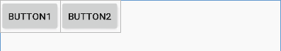
例如,将button B 放到 button A 的右边(图1)
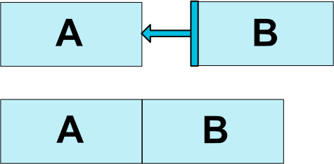
xml代码如下:
<Button android:id="@+id/buttonA" ... />
<Button android:id="@+id/buttonB" ...
        app:layout_constraintLeft_toRightOf="@+id/buttonA" />
上面的代码告诉系统,我们想要button B的左侧被约束到button A的右侧。这样一个位置约束意味着系统尝试使这两侧在同一个位置上。
下面是所有可用的约束(图2):
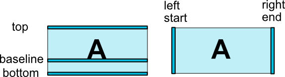
layout_constraintLeft_toLeftOflayout_constraintLeft_toRightOflayout_constraintRight_toLeftOflayout_constraintRight_toRightOflayout_constraintTop_toTopOflayout_constraintTop_toBottomOflayout_constraintBottom_toTopOflayout_constraintBottom_toBottomOflayout_constraintBaseline_toBaselineOflayout_constraintStart_toEndOflayout_constraintStart_toStartOflayout_constraintEnd_toStartOflayout_constraintEnd_toEndOf
这些属性需要使用view的 id 或者 parent 作为值。
2. Margins
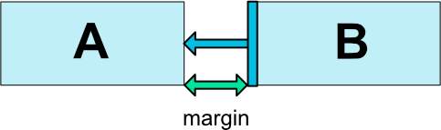
如果设置了margin,它们将会作用于对应的约束上(图3),将边距强制作为为目标和源之间的空间。通常有如下属性:
android:layout_marginStartandroid:layout_marginEndandroid:layout_marginLeftandroid:layout_marginTopandroid:layout_marginRightandroid:layout_marginBottom
2.1 作用到GONE控件上的Margins
当 约束目标 的可见性为View.GONE时,可以使用以下属性指定要使用的不同的margin:
layout_goneMarginStartlayout_goneMarginEndlayout_goneMarginLeftlayout_goneMarginToplayout_goneMarginRightlayout_goneMarginBottom
举一个简单的例子,两个Button的布局如下:
<?xml version="1.0" encoding="utf-8"?>
<android.support.constraint.ConstraintLayout
    ...>

    <Button
        android:id="@+id/button1"
        ...
        app:layout_constraintStart_toStartOf="parent" />

    <Button
        android:id="@+id/button2"
        ...
        app:layout_goneMarginStart="16dp"
        app:layout_constraintStart_toEndOf="@id/button1"/>

</android.support.constraint.ConstraintLayout>
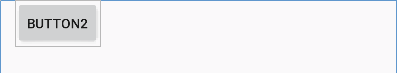
当约束目标(button1)可见性分别为View.VISIBLE和View.GONE时,显示如下:
3. 居中和偏移(Bias)
ConstraintLayout一个有用的方面在于如何处理“不可能”的约束。比如,布局代码如下:
<android.support.constraint.ConstraintLayout ...>
    <Button android:id="@+id/button" ...
            app:layout_constraintLeft_toLeftOf="parent"
            app:layout_constraintRight_toRightOf="parent/>
</>
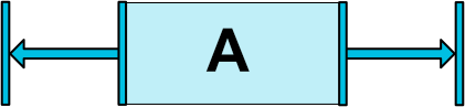
除非ConstraintLayout恰好具有与Button完全相同的大小,否则上面两个约束不能同时满足(两条边都不会是我们想要的位置)。
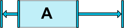
在这种情况下,约束的作用就像是相反的力量平等的拉Widget(图4),这样Widget最终将在父容器中居中。这同样适用于垂直方向上的情况。
值得一提的是,在这两个约束的前提下,如果上面的Button的layout_width不同,效果也不同。如下所示:


3.1 偏移(Bias)
上面这种相反的约束的效果默认是使Widget居中;但是我们可以使用bias属性调整力量的比例:
layout_constraintHorizontal_biaslayout_constraintVertical_bias
比如,下面的代码可以使左侧使用30%的偏移而不是默认的50%,这样会使左侧更短,从而导致Widget更倾向于左侧(图5):
<android.support.constraint.ConstraintLayout ...>
    <Button android:id="@+id/button" ...
            app:layout_constraintHorizontal_bias="0.3"
            app:layout_constraintLeft_toLeftOf="parent"
            app:layout_constraintRight_toRightOf="parent/>
</>
使用偏移,我们可以制作更好地适应屏幕尺寸变化的用户界面。
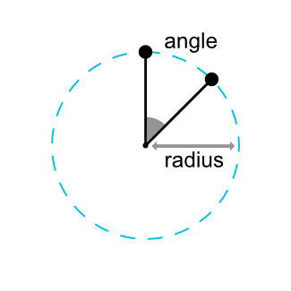
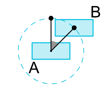
4. 圆形定位(1.1新增)
我们可以用角度和距离来约束一个Widget的中心相对于另一个Widget的中心。这允许我们将Widget放在圆上(图6)。以下属性可以使用:
layout_constraintCircle: 另一个widget的idlayout_constraintCircleRadius: 到另一个widegt中心的距离layout_constraintCircleAngle: Widget应该处于哪个角度 (0~360的角度)
<Button android:id="@+id/buttonA" ... />
<Button android:id="@+id/buttonB" ...
        app:layout_constraintCircle="@+id/buttonA"
        app:layout_constraintCircleRadius="100dp"
        app:layout_constraintCircleAngle="45" />
5. 可见性行为
ConstraintLayout对标记为View.GONE的Widget有特定处理。
像往常一样,GONE widgets 不会显示,也不是布局本身的一部分(即如果标记为GONE,它们的实际尺寸将不会更改)。
但就布局计算而言,GONE widgets 仍然是其中的一部分,具有重要的区别:
- 对于布局过程,它们的尺寸将被视为零(基本上,它们将被解析为一个点)
- 如果他们对其他widgets有约束,它们仍然会起到作用,但任何边距都会好像等于零
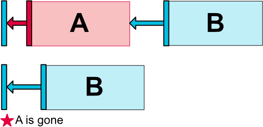
这种特定的行为允许我们在构建布局时暂时将widget标记为GONE,而不会破坏布局(图7),这在进行简单的布局动画时尤其有用。
注意: 使用的边距将是B在连接到A时定义的边距(例如图7)。在某些情况下,这可能不是我们想要的margin(例如,A距其容器的一边有100dp的边距,B到A只有16dp;如果A标记为GONE,那么B到容器的边距为16dp)。因此,我们可以指定在连接到标记为GONE的widget时要使用的备用margin(请参阅上面有关作用到GONE控件上的Margins的部分)。
6. 尺寸约束
6.1 ConstraintLayout中的最小尺寸
我们可以为ConstraintLayout本身定义最小和最大尺寸:
android:minWidth设置layout的最小宽度android:minHeight设置layout的最小高度android:maxWidth设置layout的最大宽度android:maxHeight设置layout的最大高度
当ConstraintLayout的尺寸被设置为WRAP_CONTENT时,这些最小、最大值会被使用。
6.2 Widget的尺寸约束
widget的尺寸可以通过设置android:layout_width和android:layout_height的属性值来指定,有如下三种方式:
- 使用具体值
- 使用
WRAP_CONTENT,这样widget会计算自身的尺寸 - 使用
0dp,这等于“MATCH_CONSTRAINT”
前两种工作方式和其他布局一样。最后一种方式将会调整widget的尺寸来匹配设置的约束(参见图8,(a)为wrap_content,(b)为0dp)。如果设置了margin,它们将在计算中被考虑在内(图8,0dp的©)。
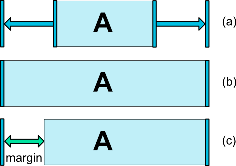
重要: 对于包含在ConstraintLayout中的Widget来说,不建议使用MATCH_PARENT。可以通过使用MATCH_CONSTRAINT来定义类似的行为,其中相应的left/right或top/bottom约束被设置为“parent”。
6.3 WRAP_CONTENT: 强制约束(1.1新增)
如果尺寸设置为WRAP_CONTENT,则在1.1之前的版本中,它们将被视为literal尺寸——这意味着约束不会限制最终的尺寸。虽然通常情况下,这就足够(并且更快),但在某些情况下,我们可能希望使用WRAP_CONTENT,同时仍然强制执行约束以限制最终的尺寸。在这种情况下,我们可以添加一个相应的属性:
app:layout_constrainedWidth=”true|false”app:layout_constrainedHeight=”true|false”
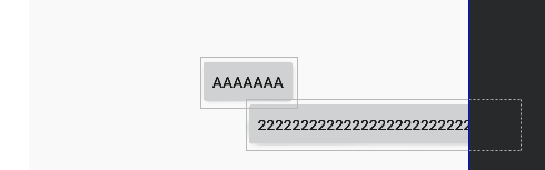
上面比较难理解,这里给出一个例子。button1居中显示,button2约束在button1的右边、parent的左边:
<Button
    android:id="@+id/button1"
    android:layout_width="wrap_content"
    android:layout_height="wrap_content"
    android:text="aaaaaaa"
    app:layout_constraintStart_toStartOf="parent"
    app:layout_constraintEnd_toEndOf="parent"
    app:layout_constraintTop_toTopOf="parent"
    app:layout_constraintBottom_toBottomOf="parent"/>

<Button
    android:id="@+id/button2"
    android:layout_width="wrap_content"
    android:layout_height="wrap_content"
    android:text="22222222222222222222222222222"
    app:layout_constrainedWidth="true"
    android:layout_marginTop="40dp"
    app:layout_constraintTop_toTopOf="@id/button1"
    app:layout_constraintStart_toEndOf="@id/button1"
    app:layout_constraintEnd_toEndOf="parent"/>
对button2使不使用app:layout_constrainedWidth="true"的效果如下:

6.4 MATCH_CONSTRAINT 尺寸(1.1新增)
当尺寸设置为MATCH_CONSTRAINT时(也就是设置为0dp),默认行为是使结果大小占用所有可用空间。几个额外的修饰符如下:
layout_constraintWidth_min和layout_constraintHeight_min:将设置此维度的最小大小layout_constraintWidth_max和layout_constraintHeight_max:将设置此维度的最大大小layout_constraintWidth_percent和layout_constraintHeight_percent:将此维度的大小设置为parent的百分比
例如,使button1的宽度为parent的50%,可以这样:
<Button
        android:id="@+id/button1"
        android:layout_width="0dp"
        ...
        app:layout_constraintWidth_default="percent"
        app:layout_constraintWidth_percent="0.5"
        app:layout_constraintStart_toStartOf="parent"
        app:layout_constraintEnd_toEndOf="parent"/>
最小与最大
最小与最大的值可以是一个dp数值,也可以是“wrap”,后者将会使用WRAP_CONTENT的值。
百分比尺寸
想要使用百分比,我们需要按照以下步骤:
- 尺寸必须设置为
MATCH_CONSTRAINT(0dp) - 默认值应该设置为percent
app:layout_constraintWidth_default="percent"或app:layout_constraintHeight_default="percent" - 最后设置
layout_constraintWidth_percent或layout_constraintHeight_percent属性,值在0~1之间
比例
我们可以将Widget的一个维度定义为另一个维度的比例。为此,我们需要将至少一个约束维度设置为 0dp (即 MATCH_CONSTRAINT ),并将属性 layout_constraintDimensionRatio 设置为给定比率。例如:
<Button android:layout_width="wrap_content"
        android:layout_height="0dp"
        app:layout_constraintDimensionRatio="1:1" />
上面的例子会将 button 的高度设置为与其宽度相同。
比例可以是以下值:
- float值,代表宽比高的比例
width:height格式的字符串
在宽高都被设置为MATCH_CONSTRAINT (0dp)时,我们也可以使用比例。这种情况下,系统会在满足所有约束,且维持指定比例的情况下,设置最大的尺寸。
我们还可以基于一个维度的尺寸来约束另一个维度的尺寸,只需要在比例中添加"W,"或"H,"前缀来约束宽或高。比如,button 的一个维度被两个条件约束(e.g. 宽为0dp,在父布局中居中),我们可以通过在比例前增加“W”(约束宽)或“H”(约束高),并以逗号分割来指定约束哪个维度。
<Button android:layout_width="0dp"
        android:layout_height="0dp"
        app:layout_constraintDimensionRatio="H,16:9"
        app:layout_constraintBottom_toBottomOf="parent"
        app:layout_constraintTop_toTopOf="parent"/>
上面的例子中,首先高度服从约束,所以高度为parent的高度;然后,宽度会服从比例的约束,高:宽=16:9。这个button的最终结果就是,如果parent大小刚好是16:9,那么button就会刚好占满整个屏幕。
app:layout_constraintDimensionRatio="H,16:9" 指的是 H:W=16:9
app:layout_constraintDimensionRatio="W,16:9" 指的是 W:H=16:9
app:layout_constraintDimensionRatio="16:9" 指的是 W:H=16:9
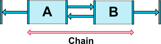
7. 链(Chains)
链提供了一条轴(水平或数值)上的群体行为。另一条轴可以单独约束。
创建链
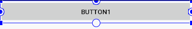
一系列彼此之间双向连接的widgets可以理解为一条链(如图9,两个widgets组成的最小的链)
链头 (Chain heads)
链的第一个元素(也称之为链“头”)上的属性控制着整个链:
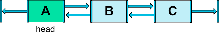
水平链上最左边的widget就是链头;同理,竖直链上最上面的widget是链头。
链中的margin
If margins are specified on connections, they will be taken in account. In the case of spread chains, margins will be deducted from the allocated space.(这句实在是无法信达雅,大致意思就是说:链中的margin会被考虑在内。在spread模式下,先处理margin,剩下的空间交给widget处理)
链的样式
通过在链头上设置layout_constraintHorizontal_chainStyle或layout_constraintVertical_chainStyle属性,可以改变链的样式(默认为CHAIN_SPREAD)。
CHAIN_SPREAD- 元素将会展开,Flutter中MainAxisAlignment.spaceEvenly的效果(默认样式)- 权重链(Weighted chain) - 在
CHAIN_SPREAD模式中,设置为MATCH_CONSTRAINT的widgets,将会平分剩下的空间 CHAIN_SPREAD_INSIDE- 和CHAIN_SPREAD类似,但链的两端不会展开,Flutter中MainAxisAlignment.spaceBetween的效果CHAIN_PACKED- 链中的元素会挤在一起。bias属性会影响整体的位置。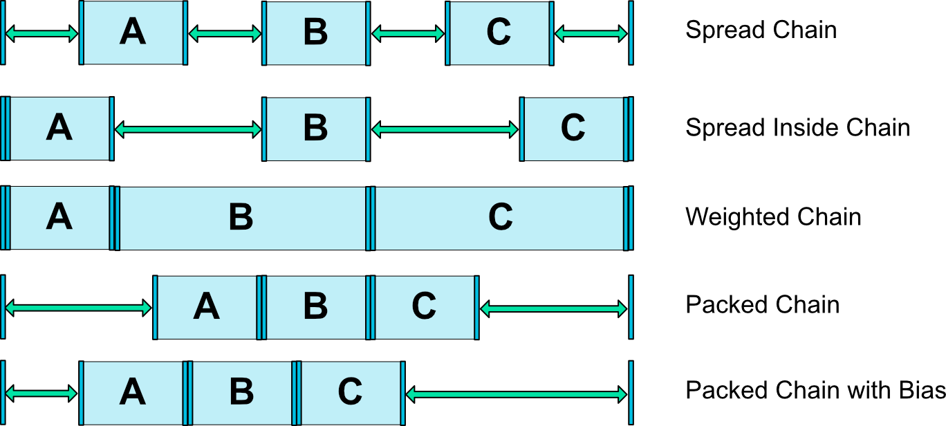
图11 链的样式
权重链
链的默认行为是元素平分可用的空间。如果一个或多个元素使用了MATCH_CONSTRAINT,它们将会使用其他元素用剩的所有可用的空白空间(相互之间平等分配,整个行为就像LinearLayout那样)。layout_constraintHorizontal_weight和layout_constraintVertical_weight属性将会控制MATCH_CONSTRAINT元素怎样分配空间。例如,一条链中两个元素使用MATCH_CONSTRAINT,第一个元素权重为2,第二个元素权重为1,因此,第一个元素占用的空间会是第二个元素的两倍。
Margins与链(1.1版本中)
在链中的元素上使用margin时,margin是相加的。
例如,在水平链上,如果一个元素定义了10dp的右边距,而下一个元素定义了5dp的左边距,则这两个元素之间产生的边距为15dp。
在计算链中用于定位items的剩余空间时,会同时考虑item及其边距。剩余空间中不包含边距。
8. 虚拟辅助对象(Virtual Helper objects)
除了上面描述的功能之外,我们还可以使用ConstraintLayout中的特殊辅助对象来帮助我们进行布局。一般,辅助对象不会显示在设备上(因为它们都是View.GONE的),只用来辅助布局,且只适用于ConstraintLayout中。
目前,Guideline对象允许我们创建相对于ConstraintLayout容器定位的水平和垂直辅助线。widgets可以约束在这些辅助线上。
在1.1版本中,也增加了Barrier、Group、Placeholder三个辅助对象。
Guideline
Guideline可以是水平或者竖直的:
- 竖直Guideline宽度为0,高度为
ConstraintLayoutparent的高度 - 水平Guideline高度为0,宽度为
ConstraintLayoutparent的宽度
Guideline的位置可以由下面三种方式决定:
- 从layout的左边或上面开始指定一个固定的距离(dp值) -
layout_constraintGuide_begin - 从layout的右边或下面开始指定一个固定的距离(dp值) -
layout_constraintGuide_end - 指定layout的宽度或高度的百分比位置(0~1浮点数) -
layout_constraintGuide_percent
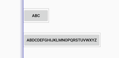
Barrier
Barrier接收多个widget的id作为参数,基于最极端的widget的指定的一侧创建一个虚拟的辅助线。
Barrier的方向可以通过barrierDirection来设置,有如下可选值
leftstartrightendtopbottom
例如,这里有两个button,分别是@id/button1和@id/button2。constraint_referenced_ids将会引用它们,两个id之间用逗号区分。
<android.support.constraint.Barrier
        android:id="@+id/barrier"
        android:layout_width="wrap_content"
        android:layout_height="wrap_content"
        app:barrierDirection="start"
        app:constraint_referenced_ids="button1,button2" />
Barrier的方向设置为了start,所以结果如下:
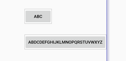
相反的,我们将Barrier的方向设置为end,结果如下:
如果widgets的尺寸变化了,Barrier将会根据设置的方向自动移动到最极端的widget上:

其他widget可以约束到Barrier上,而不是单独的widget。这样的话,我们的layout可以自动适配widget尺寸的变化(比如,对于同一个单词,不同语言下长度会不一样)。
Barrier如果引用了GONE的widgets,默认行为会基于GONE后的坐标创建障碍。如果我们不想让Barrier将GONE的widgets考虑在内,我们可以将barrierAllowsGoneWidgets属性设置为false(默认为true)。
Group
Group的作用就是控制所有引用的widget的可见性。widget id之间还是用逗号分割:
<android.support.constraint.Group
        android:id="@+id/group"
        android:layout_width="wrap_content"
        android:layout_height="wrap_content"
        android:visibility="visible"
        app:constraint_referenced_ids="button4,button9" />
使用这种方式隐藏、显示一组widget是非常容易的,不需要程序性的维护这个集合。
多个Group可以引用同一个widget,在这种情况下,xml定义的顺序会导致最后的可见性状态(最后定义的group最终会生效)。
Placeholder
Placeholder提供可一个能够定位在已存在对象上的可见对象。
当另一个view的id设置到了placeholder上(通过setContent()方法),placeholder会变成content view。如果content view存在在屏幕上,那么它会从原来的位置gone。
content view的位置由布局中Placeholder的参数决定(Placeholder可以向其他view一样被约束),content view的其他属性由content view自己决定。
9. Optimizer (1.1版本中)
在1.1版本中,暴露了约束优化器。我们可以在ConstraintLayout上通过添加app:layout_optimizationLevel的方式,决定使用哪种优化。
- none : 不使用任何优化
- standard : 默认值。仅优化direct、barrier约束
- direct : 优化direct约束
- barrier : 优化barrier约束
- chain : 优化chain约束(试验性)
- dimensions : 优化尺寸测量(试验性), 减少匹配约束元素的测量的次数
该属性是一个掩码(mask),所以我们可以决定打开或关闭指定的优化。
比如,app:layout_optimizationLevel="direct|barrier|chain"。
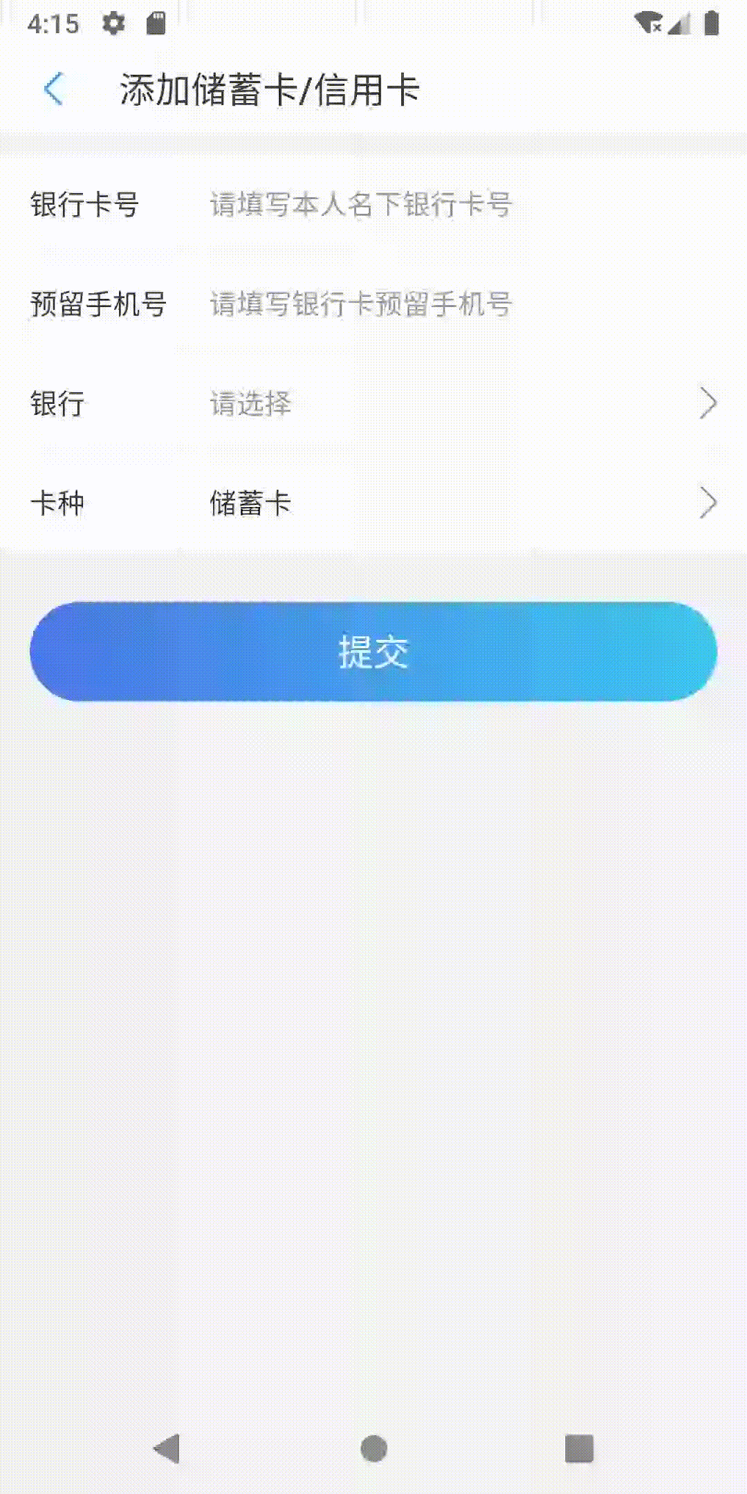
10. ConstraintSet
ConstraintSet允许我们通过代码设置一系列约束,除此之外,还能对ConstraintLayout里面的控件做动画。
首先,我们通过各种方式初始化好两个需要交替互换的ConstraintSet。这里两个ConstraintSet中只有一个Group显示与隐藏的区别。
private lateinit var debitCardSet: ConstraintSet
private lateinit var creditCardSet: ConstraintSet

private fun initView() {
    debitCardSet = ConstraintSet()
    debitCardSet.clone(constraintLayout)
    debitCardSet.setVisibility(R.id.groupCreditCard, View.GONE)
    creditCardSet = ConstraintSet()
    creditCardSet.clone(constraintLayout)
    creditCardSet.setVisibility(R.id.groupCreditCard, View.VISIBLE)
}
然后,在需要切换Group的显示与隐藏时,调用下面的方法:
private fun showCreditCard(showCreditCard: Boolean) {
    val transition = AutoTransition()
    transition.duration = 200
    TransitionManager.beginDelayedTransition(constraintLayout, transition)
    val constraintSet = if (showCreditCard) creditCardSet else debitCardSet
    constraintSet.applyTo(constraintLayout)
}
显示效果如下: